

Little Einstein
JJJJJ
LITTLE EINSTEIN
Online STEM Toy Store UX/UI DesignQuick Look (On Behance)
Overview

This project is a teamwork project in the UX class (Spring 2018). In this project, we were supposed to design an online web store for our client Little Einstein, which is a STEM toy store. This project is aiming to train our comprehensive abilities on UX research rather than UX design.
My Role

I was responsible for the client's research, user research (persona) and competitive research. Also, I finished the website wireframe redesign and UI design work after the class.
Challenge

solution
Research


client research
Little Einstein is a new online retailer of curated and innovative learning kits for kids. It was formerly a beloved shop in Park Slope Brooklyn that sold all types of DIY kits (both analog and digital), but the storefront was too expensive and the shop closed in 2012. The owner wants to convert the store to online only and the owner (Alberta) now wants to focus inventory on technology and electronics products geared towards kids ages 4 - 15.

client’s needs
The owner hopes the online store can not only be a commercial place but also an educational place.

Competitors
According to our client’s requirement, we reviewed three existing online stores to get inspiration and did a simple marketing position analysis to figure out what should our position be. Based on the first research, we decided to firstly balance commerce and education. Secondly, pay attention to interaction and add the cultural part.


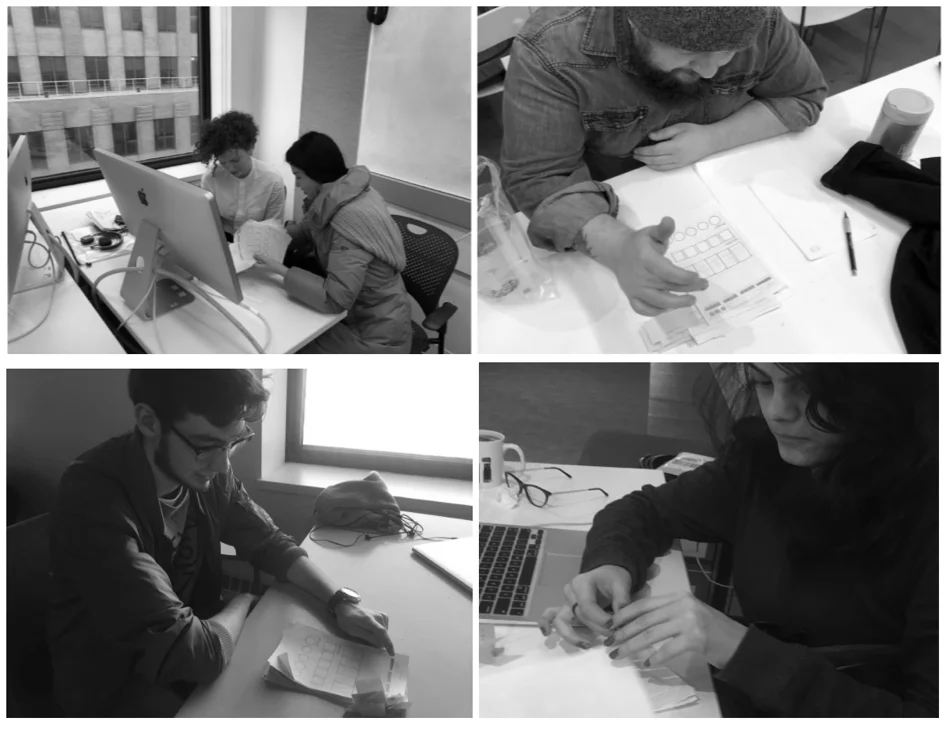
CONTEXTUAL INQUIRY
We went to a local toy store to take a contextual inquiry. We did a questionnaire at first and prepared to interview the employees, the customers and the kids (if it is possible). The lucky thing is we met the co-owner directly (the middle one on the last page). He shared lots of precious information with us. And we met two customers in total to know their commercial needs. According to our contextual research, we collected the information from our interview and divided it into two parts.
Click the image to enlarge it
persona
We designed four personas to correspond to the grandparent group, the parent group, the relative and the kid group. Our target users are educated and well-being family. They all have different needs for buying toys online because they value different aspects of toys. The elder group prefers to use toys to build more connections with their grandchildren. The parent group prefers to educate their children better with STEM toys. The relatives may think higher of the online shopping experience while the kids mainly buy toys based on their interests.
Ideation


customer’s needs & solutions
According to our research, we extracted all of the potential customers’ needs and came up with the solutions accordingly. For the grandparent group, it is important for them to know what is popular among kids now and know which toy is better, so we designed the hottest product recommendation function and allow users to compare toys in the shopping cart directly, rather than browsing different pages repeatedly. For the parent group, we come up with a new sorting method - Ability Radar map to let them select toys based on what kids can learn from it quickly. We also provide a community page for them sharing their parenting experience. For the relatives, they have a higher requirement for the shopping experience. They want to select an appropriate toy within a short time, so the product filter and smart shopping assistant will help them. Kids are mainly focused on the toy itself so we provide abundant teaching resources and online playgrounds to allow them to take a try.


little einstein’s needs & solutions
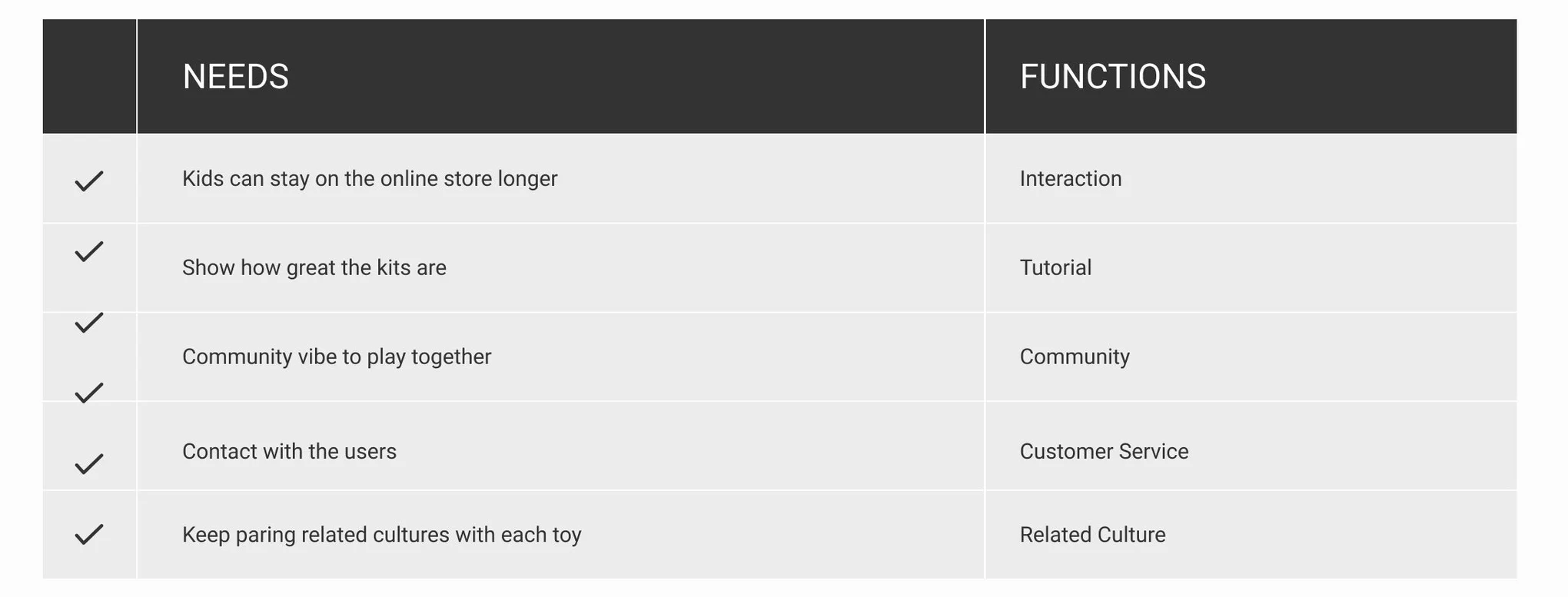
Additionally, we also review Little Einstein’s needs and noticed that our client also wants the kids can stay on the online store longer and can keep paring related cultures with each toy. Thus, we designed the weekly challenge activity to appeal the kids visit their website frequently to improve the user stickiness. We also decided to move the related cultures and stories behind the toys to the product’s intro page, which may let each of the toys be more special, attractive and meaningful.


SPECIAL category sorting - Ability RADAR MAP
At first, we sorted the products mainly by STEAM, but it is not that useful because each toy can be classified into more than one category. Thus, we decided to set up the ability radar map as the main category method. The advantage is ability radar map allows the product to have all of the five elements but also can be marked as the highest ability element. It will be more scientific in organizing all of the toys better and it will also highlight the parent group’s need for STEAM toy’s educational part.
We also did the first user test about which category is better. After tested with 5 people, we found 4 people chose the ability radar, so finally, we used ability radar as the main category method.

Final Proposal
So based on all of the former research and ideation, we finally came up with our core functions: the Homepage is the collection of all of the other three pages. It will post the hottest products and activities, the ability radar category, the product and blogger recommendations. The Shop page is where the customers find and but the toys that they like. The product detail page has the related resources (including related cultures the client mentions) especially. Customers also can compare the products in the cart directly. The Community page provides different workshops, articles, forum and interest groups for both adults and kids to choose. The Education page is where the kids can participate in the weekly challenge, play toys online and watch tutorials.

COMPARATIVE ANALYSIS
By comparing the comparative analysis, we can notice that Little Einstein has the complete online shopping process and makes up the blank of the related culture part. The Ability Radar map classification is also a special part of all of the competitors. It is mainly because Little Einstein is focusing on the STEM toys, which means this store pays attention to the toy’s educational part already.
Test & Prototype


SITEMAP & USER FLOW
The first sitemap includes Four Main Pages: Shop, Community, Education, Profile. Two global functions: Cart and Log in. We invited our roommates to take a test and noticed that profile and login are repeated and the relationship between the homepage and main pages is wrong. The second version we merge profile and login into a global function and add the homepage as a new page.


paper prototype & user tasks
We did the paper prototype at first and set up three user tasks for the later users testing based on the difficulty levels. We designed three situations for our users and encourage them to think aloud during the whole process so we can notice that where they are confused and where they are excited with.

USER TESTING: PAPER PROTOTYPE
The listed problems are: our first user Kevin said sometimes he just wants to buy something directly without log in, so we need to add a quick checkout. Category icons should have a recognizable reminder and place order page should have a button to go back to the cart and the other backlinks.
interactive prototype
My partner created the interactive prototype by Axure after the first user testing and made a quick video demo about what it looks like. We used this prototype to finish the second user testing below.
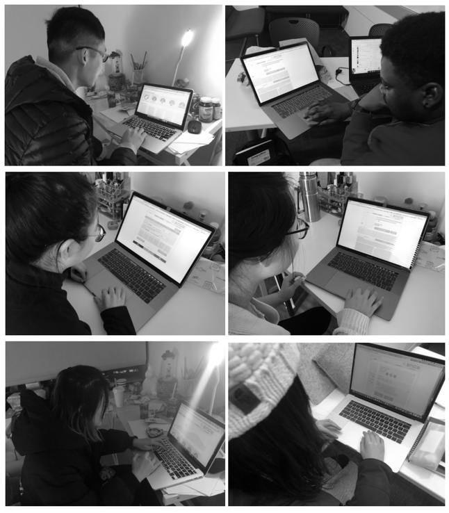

USER TESTING: INTERACTIVE PROTOTYPE
The interactive prototype went out not that well, mainly because it didn’t reflect some important functions better, like the radar map category and the compare function because of the class’s time limitation. That’s why I redesigned the wireframe and finished UI design later by myself.
CLIENT’S NEEDS SELF-EVALUATION
USER EXPERIENCE EVALUATION (10 USERS)

evaluation
Though the interactive prototype didn’t reflect some typical design very well, the feedback from the user testing is not bad. We also self-evaluate the client’s needs and the good news is we finished all of them.
Now, it’s time to move to my work: wireframe redesign and UI design.
Design


Learnings
PAY ATTENTION ON TEAMWORK
This is the first time that I walk through a pure UX/UI project as the lead researcher and web designer. What I have learned from this project is teamwork is super important in UX design projects. Because of the time limitation, we divided our works into different parts and my partner was responsible for the interactive prototype while I was responsible for the documents. My partner missed some typical functions in their job and given we lacked in-time communication, we just noticed it before the user testing. That’s why later I had to redesign the wireframe and finish the UI design after the class.
It teaches me that in UX/UI projects, we should always think of ourselves as a whole team. We should never just divide the work simply and only focused on our own business. It is pretty important in UX/UI projects because our work will be tested by the users directly. If we made any serious mistakes, it will influence the testing a lot and even made it useless.


